TECHYARD
TECHYARD is the one-stop destination for high quality computer parts and tech accessories, launched by the creators of AFTERSHOCK PC. The brief for the visual branding was to create a package that include the logo, colour palette, and typefaces to be used in visual collaterals.
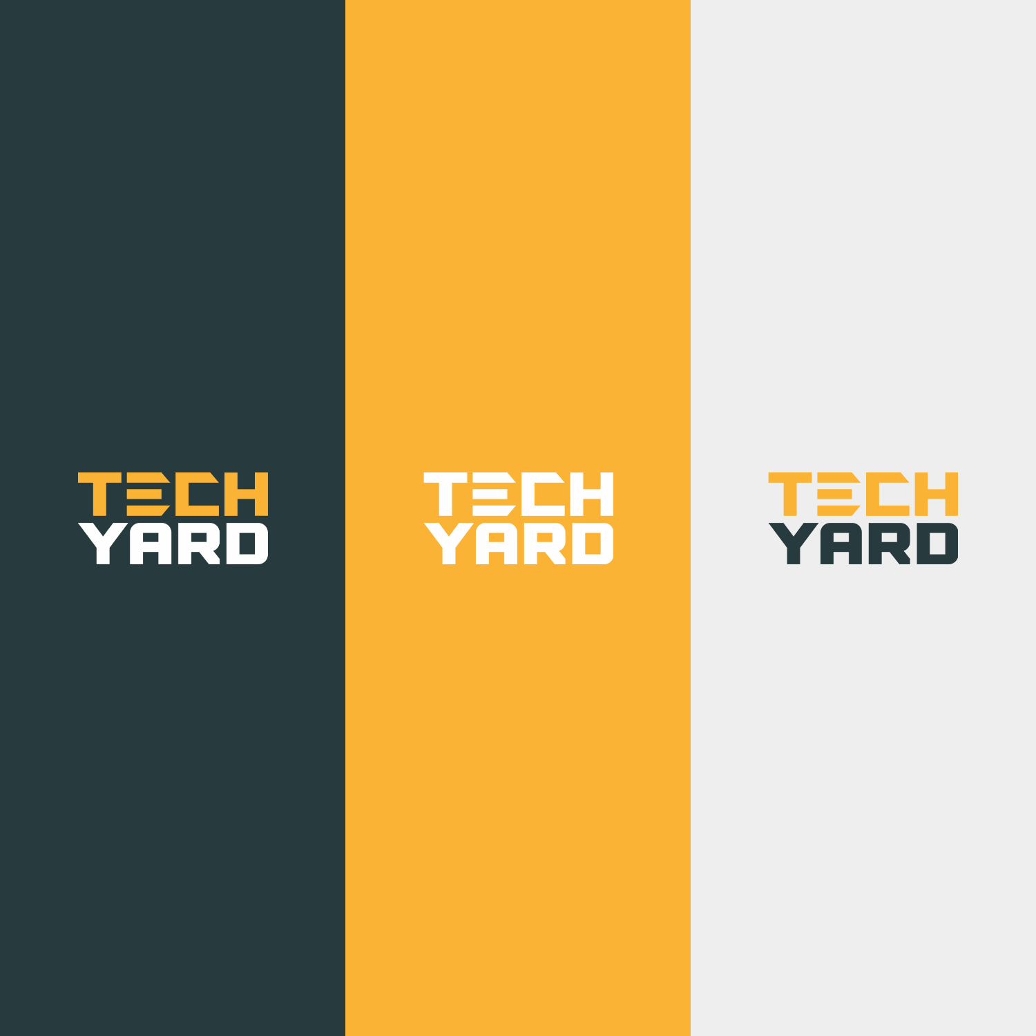
The Logo
The logo needed to be simple and easily recognisable by the public. It also had to be scalable to different sizes. It was decided that the logo would be a logotype and my job was to figure out the best look for it. I decided to keep it simple. The logo is a play on a yard sale, with the sun in the sky and green grass.

Colour Palette
The colours picked for the brand was inspired by the essence of a yard sale. The main colours resembles a sunny day and green grass. Add accents of a rustic red-orange highlights the excitement of a yard sale. The teal complements the other colours for the sense of timelessness.

Typefaces
Both Archivo and Roboto are excellent for their legibility for print and digital mediums. They are also versatile and easy to use when working with other brands with their own visual identity. Archivo is bold and distinctive while Roboto is neutral and clean. Since both typefaces are widely used and recognised, using them for TECHYARD will help establish credibility and trust with the audience.